
Introducing the box and whisker plot answer key, your ultimate guide to understanding and interpreting these powerful data visualization tools. Get ready to delve into the world of data analysis with clarity and ease.
This comprehensive guide covers everything you need to know about box and whisker plots, from their purpose and components to their construction and interpretation. Unlock the secrets of data distribution and gain valuable insights into your data.
Box and Whisker Plot Overview
Box and whisker plots are a powerful graphical tool used to visualize the distribution of data. They provide a concise summary of the data’s central tendency, spread, and potential outliers.
Box and whisker plots are particularly useful when comparing multiple datasets or identifying trends and patterns within a single dataset. They are commonly used in various fields, including statistics, data analysis, and quality control.
Real-World Applications
- Comparing the distribution of exam scores between different classes.
- Analyzing the variation in manufacturing processes over time.
- Identifying potential outliers in financial data.
- Visualizing the spread of patient ages in a medical study.
- Comparing the effectiveness of different treatments or interventions.
Components of a Box and Whisker Plot
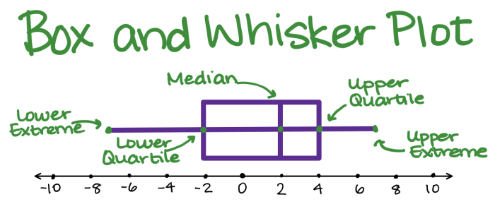
A box and whisker plot is a graphical representation of the distribution of data. It shows the median, quartiles, minimum, and maximum values of the data set.
Components
- Median: The median is the middle value of the data set when arranged in ascending order. It divides the data set into two equal halves.
- Quartiles: Quartiles are the three values that divide the data set into four equal parts. The first quartile (Q1) is the median of the lower half of the data set, the second quartile (Q2) is the median of the entire data set, and the third quartile (Q3) is the median of the upper half of the data set.
- Minimum: The minimum is the smallest value in the data set.
- Maximum: The maximum is the largest value in the data set.
Constructing a Box and Whisker Plot
Constructing a box and whisker plot involves several steps. Let’s walk through these steps and illustrate the process with an example.
1. Arrange the Data
Begin by arranging the data in ascending order from smallest to largest. This arrangement helps visualize the distribution of the data.
2. Find the Median
The median is the middle value of the ordered dataset. If there is an even number of data points, the median is the average of the two middle values.
3. Find the Quartiles
The first quartile (Q1) is the median of the lower half of the data, and the third quartile (Q3) is the median of the upper half. These quartiles divide the data into four equal parts.
4. Find the Interquartile Range (IQR), Box and whisker plot answer key
The IQR is the difference between Q3 and Q1. It represents the range of the middle 50% of the data.
5. Find the Minimum and Maximum
The minimum and maximum values are the smallest and largest values in the dataset, respectively.
6. Draw the Box and Whiskers
The box is drawn from Q1 to Q3, with a line representing the median. The whiskers extend from the box to the minimum and maximum values, excluding any outliers.
Interpreting Box and Whisker Plots: Box And Whisker Plot Answer Key
Box and whisker plots provide valuable insights into the distribution of data. By analyzing the different components of the plot, we can uncover patterns, identify outliers, and assess the overall shape of the data.
If you’re struggling with box and whisker plot answer keys, take a break and explore the fascinating ciclo de vida de la mariquita . These tiny insects go through an incredible transformation from egg to larva to pupa to adult.
Once you’ve learned about the life cycle of a ladybug, you’ll have a fresh perspective to return to your box and whisker plot answer key with renewed focus and understanding.
Identifying Outliers
- Outliers are data points that lie significantly outside the main distribution. In a box and whisker plot, outliers are represented by dots or asterisks beyond the whiskers.
- Outliers can indicate extreme values or errors in the data and should be investigated further.
Assessing Skewness
- Skewness refers to the asymmetry of the data distribution. A box and whisker plot can reveal skewness by comparing the lengths of the whiskers on either side of the box.
- If the whiskers are of unequal length, the data is skewed towards the side with the longer whisker.
- Positive skewness occurs when the distribution is shifted towards higher values, while negative skewness indicates a shift towards lower values.
Other Patterns
- Multimodal distributions:Multiple peaks in the data can indicate multiple clusters or modes.
- Gaps in the data:Large gaps between the quartiles or between the whiskers and the box can suggest missing data or distinct subgroups within the distribution.
- Symmetry:A symmetrical distribution will have whiskers of equal length and a median line that divides the box into two equal halves.
Advantages and Limitations of Box and Whisker Plots
Box and whisker plots are a versatile tool for visualizing data distribution. They offer several advantages, including their simplicity, effectiveness in displaying data distribution, and ability to identify outliers. However, they also have some limitations that should be considered when using them.
Advantages
- Simplicity:Box and whisker plots are easy to understand and interpret, making them accessible to a wide audience.
- Effectiveness:They effectively convey the central tendency, spread, and distribution of data, providing a comprehensive overview of the dataset.
- Identification of outliers:Box and whisker plots can easily identify outliers, which are data points that are significantly different from the rest of the data.
Limitations
- Sensitivity to outliers:Outliers can significantly affect the shape and position of the box and whiskers, potentially distorting the overall representation of the data.
- Inability to show individual data points:Box and whisker plots do not show individual data points, which can be a limitation when detailed information about the data is required.
Applications of Box and Whisker Plots
Box and whisker plots are versatile tools used in various fields to analyze and visualize data. Their ability to provide a comprehensive overview of data distribution and identify outliers makes them a valuable asset for data exploration and analysis.
Statistics and Data Analysis
In statistics, box and whisker plots are used to compare multiple data sets, identify outliers, and assess data variability. They help researchers understand the central tendency, spread, and shape of data distributions. For instance, in a study comparing the salaries of different professions, a box and whisker plot can reveal the median salary, interquartile range, and presence of any outliers.
Quality Control
Box and whisker plots play a crucial role in quality control processes. They are used to monitor and maintain the consistency of products or processes. By tracking the distribution of measurements over time, manufacturers can identify deviations from specifications and take corrective actions.
For example, in a manufacturing plant, a box and whisker plot of product dimensions can help identify any production issues that need to be addressed.
Question & Answer Hub
What is the purpose of a box and whisker plot?
To visualize the distribution of data, identify outliers, and compare multiple datasets.
What are the five main components of a box and whisker plot?
Minimum, maximum, median, first quartile, and third quartile.
How can I construct a box and whisker plot?
Order the data, find the five components, and plot them using a horizontal line for the median, a box for the quartiles, and lines for the minimum and maximum.
What does the shape of a box and whisker plot tell me?
The symmetry or skewness indicates the distribution of data, and the length of the box and whiskers shows the variability.
